Amy Heidbreder
Blogger and Freelancer
Amy is a professional web content manager in megachurch world and a humble amateur equestrian. Follow her adventures of praying and riding. Available for freelance.
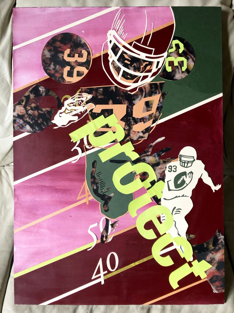
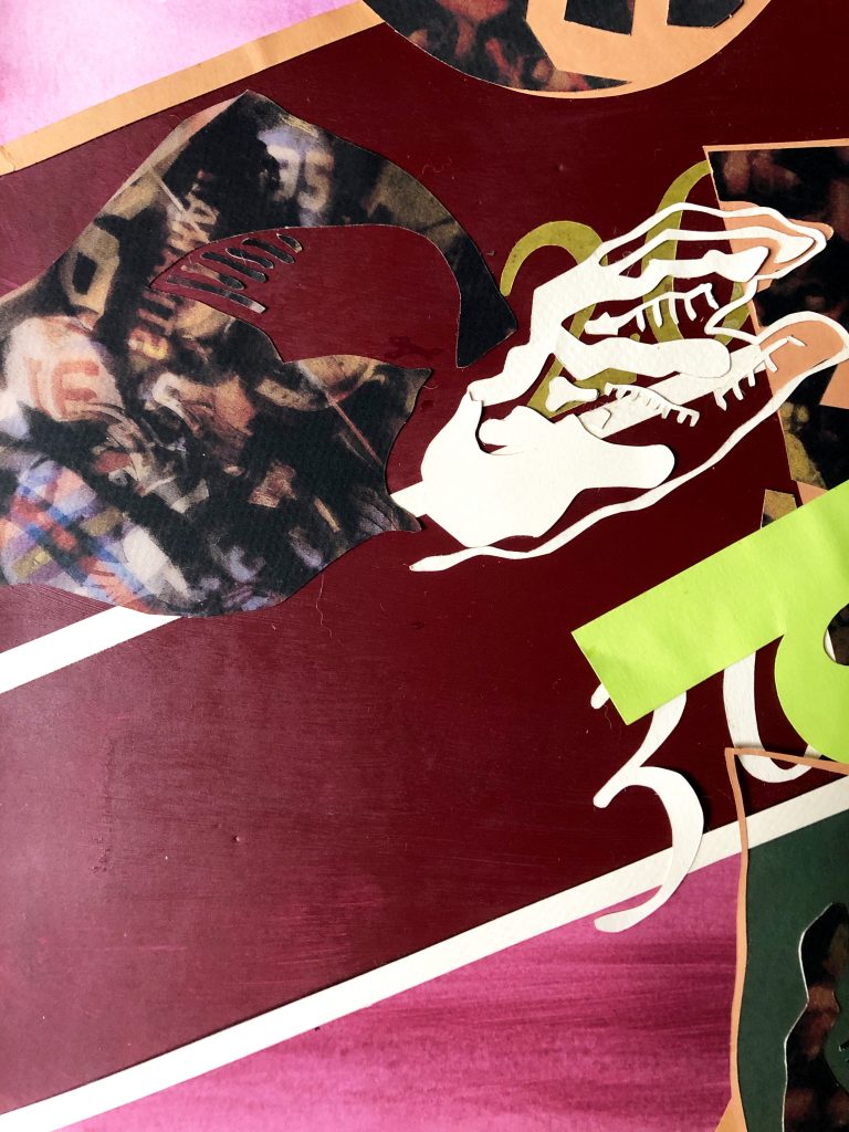
With Love: Protect (2008)
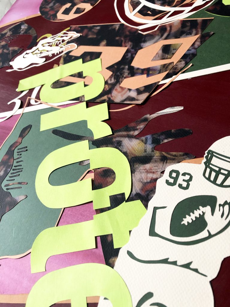
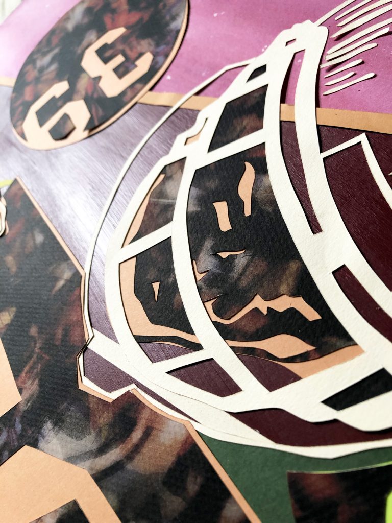
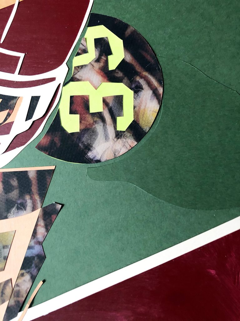
Printed Scans on Paper, Cut Paper, Acrylic Paint on Bristol Board, Mounted on Black Foam Core
A couple of weeks ago, I wrote a blog about being inspired to include some of my art and early graphic design pieces in my online portfolio. Many of these pieces are compositions constructed by hand or made “with love, not haste” as I like to say, and this piece is no exception. It has a bit of a backstory. What I like about all of my favorite portfolio pieces is that they have purpose and each piece has meaning—it’s composition and colors carefully considered in their significance.
This project was birthed out of a school assignment. This particular assignment represented the pinnacle of Intermediate Graphic Design at the University of Houston—the coveted poster. This was the piece that made or broke your portfolio. The way to any art degree at the University of Houston was through an audition, and the way you auditioned for the Graphic Communications program, also known as Block, for the nature of the junior and senior level courses—all organized in a block—was a portfolio review. You set up your entire portfolio, all strong pieces accumulated over your last few semesters, on a wall and table. A panel of professors reviewed everyone’s work and after reviewing left letters of acceptance or rejection at each set up. You found out your status when you came to collect your portfolio and tear down your set up.
Generally, students did not make it into Block their first audition. And it was recommended that students take Intermediate Graphic Communications twice to continue building a better portfolio. This poster is from my second attempt at Intermediate.
The premise of the project was to capture the essence of a sport in one visual using up to three words. We had a list of sports to choose from. American Football was not my first choice. For some reason I wanted to do fencing, and I was not the only student who chose fencing. The professor was shocked at how many other students wanted to do fencing and ironically enough, nobody chose the two most iconic American sports on the list: baseball or football. “Seriously,” she exclaimed. “Nobody picked baseball or football? Come on, someone’s got to do those. Anybody want to switch?” A tentative student piped up for baseball. “No takers for football? Really,” she said again. “Will anybody do it? We need at least one person doing football.” I gave in and rose my hand.
“I’ll do it.”
That decision led to one of my favorite creations as a student. My mother liked it too, so much so, I no longer possess this poster. My mother has it hanging in her work area at home.
My thinking behind this poster was the notion of the game of football being a type of modern-day warfare. Cities face off and send their teams marching into battle—the spoils: pride and a trophy. This led to me creating texture throughout that was somewhat camouflage like. I created it by printing scans from an issue of Sports Illustrated on transparencies, then layering those transparencies over each other and scanning them, and then printing those scans on tan and taupe colored paper. I also used army green in the composition, which is offset with a complimentary-esque color palate. I used a brighter green to emphasize one word in the composition. The word protect is used a lot in American football and in this case, it became the subject and emphasis of the composition. The goal was to visually interpret the essence of protecting possession of the football.
The composition’s focal point is the player shielding the football in the nook of his arm. He is endangered by the massive looming player in the back drop and his mission is called out in the word protect. I included lines and a technical detail to the poster because I feel football is a technical sport. As the saying goes, it’s “a game of inches.”
I feel like the best creative work is not just “pretty.” It’s not just something arbitrarily placed. It’s far more considered. It’s laid out on a grid or grids. Each component has purpose. More work should be done with purpose and less speed. In this world of quick advertising, good graphic design is sometimes hard to come by and even harder to find is good craft. Perhaps this poster ended up representing something more than just protecting a football as it has aged. It stands staunchly protecting craft, taking a bold stance for hand done work.
Build with love, not haste.
